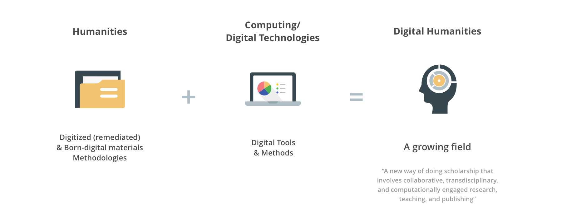
Digital Scholar Lab (DSLab) is a Gale product for digital humanists and scholars, which offers solutions and possibilities to the most common challenges in the digital humanities. During the summer, I focused on designing interactive visualization of sentiment analysis and document clustering results for the DSLab analysis tools.
UX Intern @ Gale, Cengage Learning
June 2018 - Aug. 2018
Mentor: Thomas Piggott (Senior UX Designer)
Tools: Axure, Sketch
Sentiment analysis, also called opinion mining, aims to analyze and understand the attitude, the overall contextual polarity or the emotional reaction to the context of a speaker, writer...
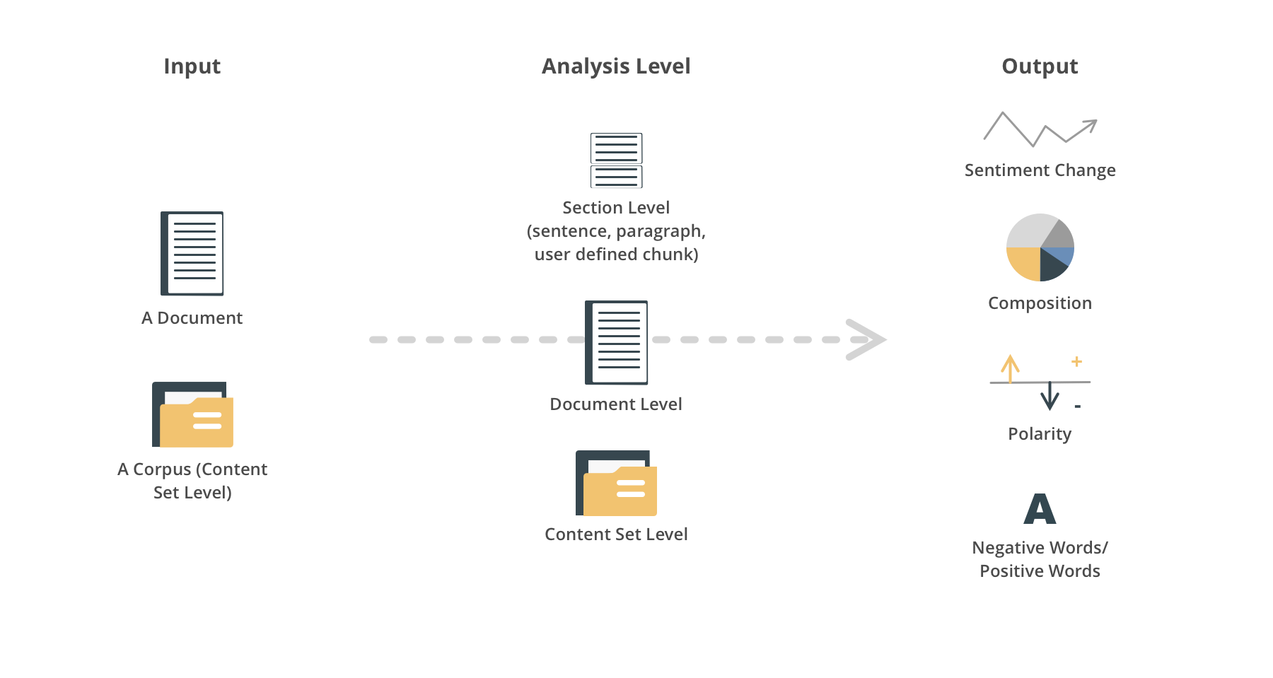
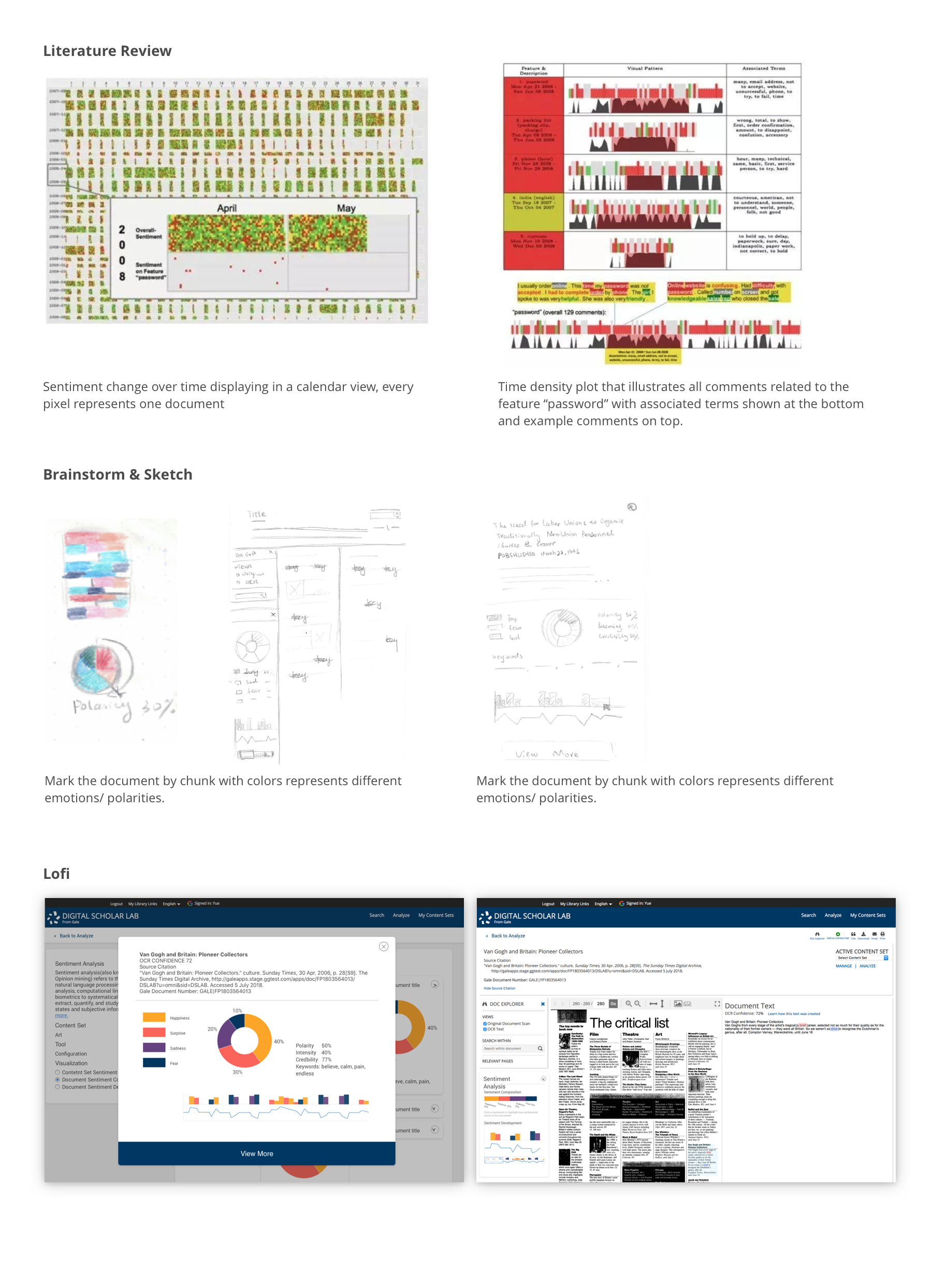
After literature review, I found the outputs of sentiment analysis can be polarity values, polarity levels, sentiment intensity, keywords and detailed emotions. And color, line, bar and various elements are used to visualize the value and trend. Examples will be shown later in iteration section.
There are several user scenarios:
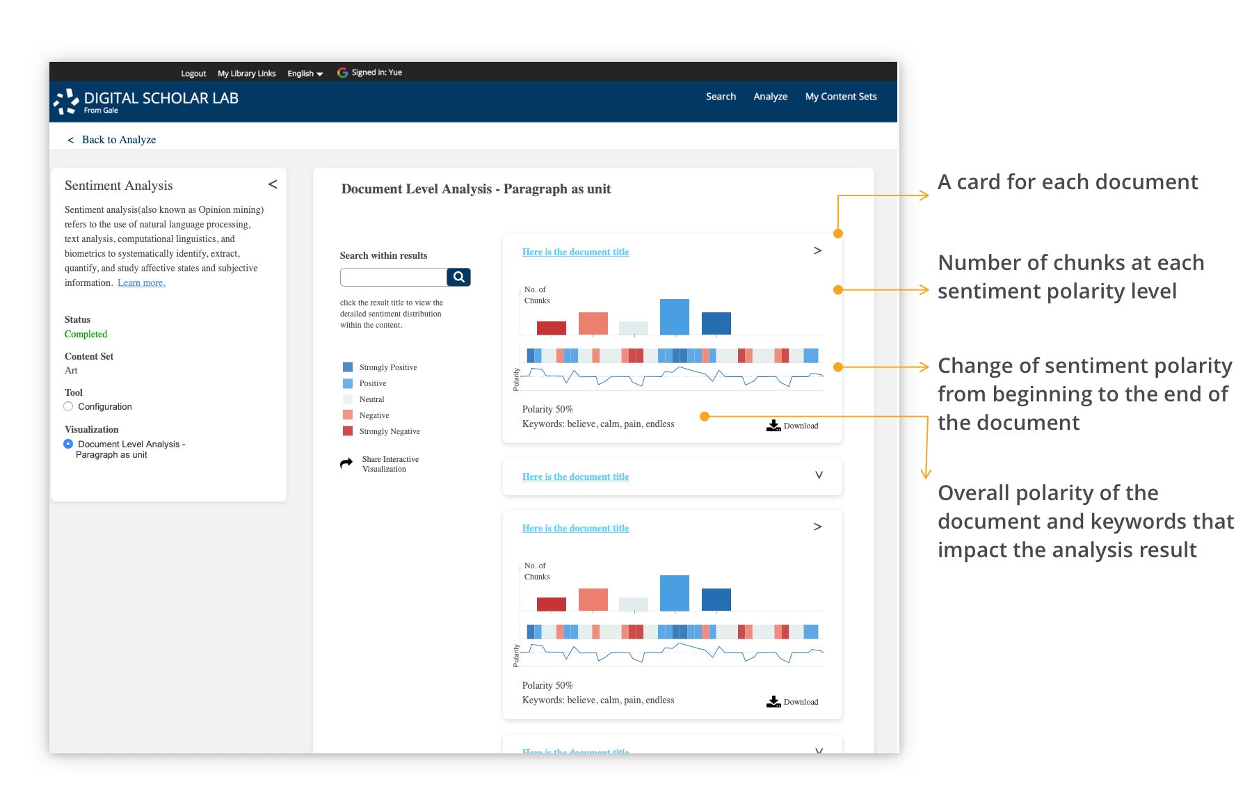
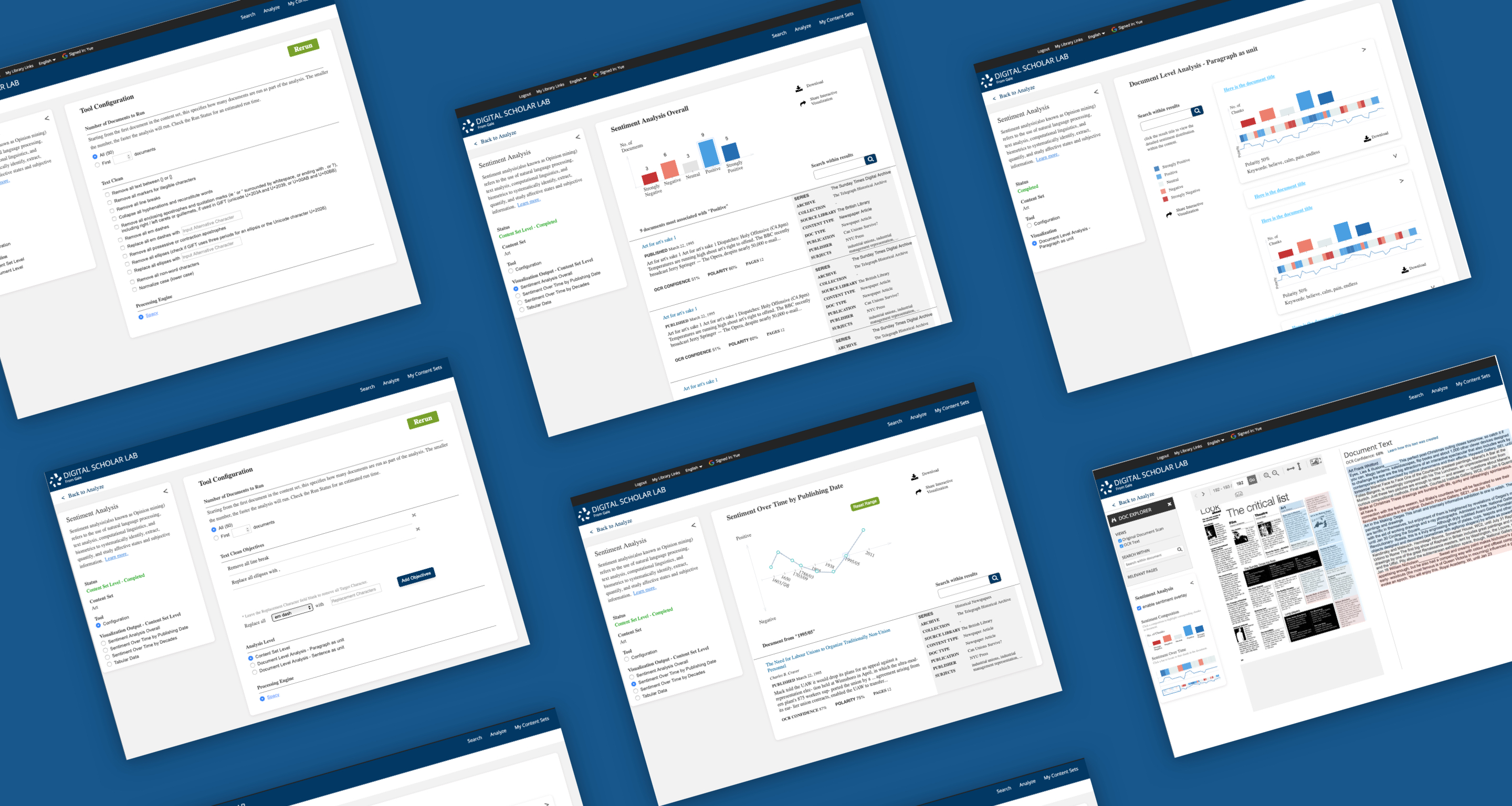
The visualization shows the overall sentiment distribution, key sentiment words and sentiment change analyzed by section of each document in the whole content set. User can click each card to view the detail of the document within content.
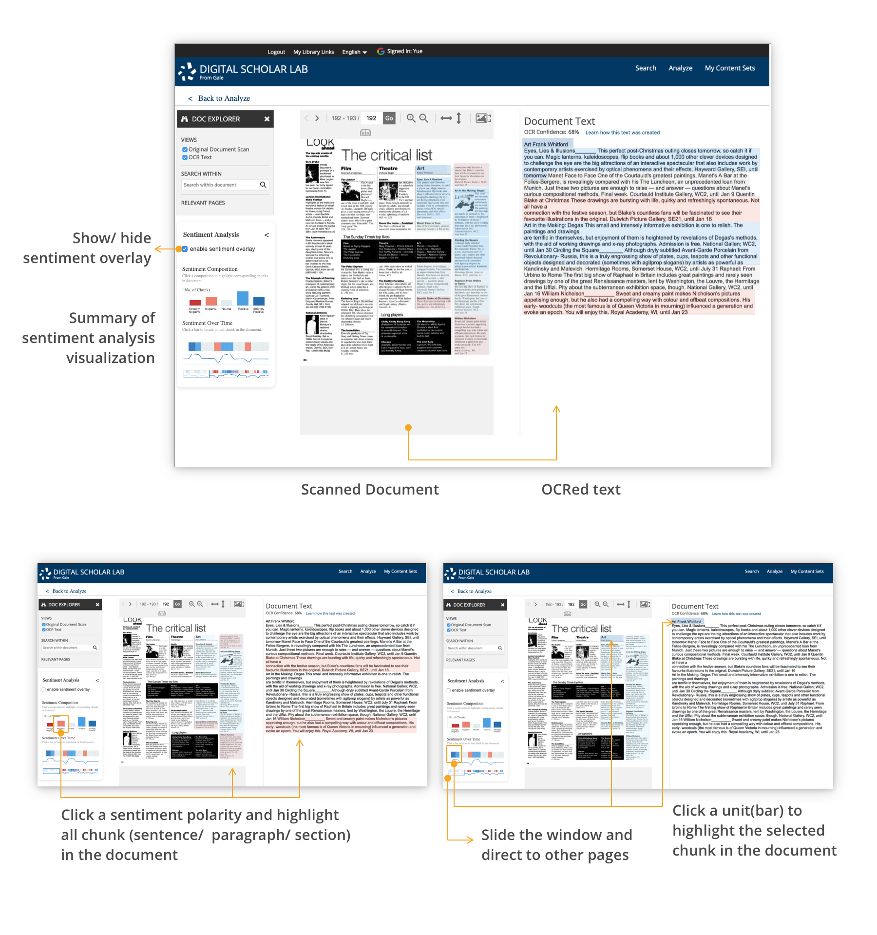
On the document/article page, a visualization summary panel is added under the existing DOC EXPLORER. The visualization contains three parts, the sentiment overlay, the overall sentiment, and the sentiment development of the document. The sentiment overlay will highlight the document with corresponding colors by chunk. The overall sentiment shows the number of chunks of the polarity levels. The sentiment development has a zoom-in view of the sentiment development of the current page and a scope controller showing the development of the whole document and a sliding window which can direct to the specific page.
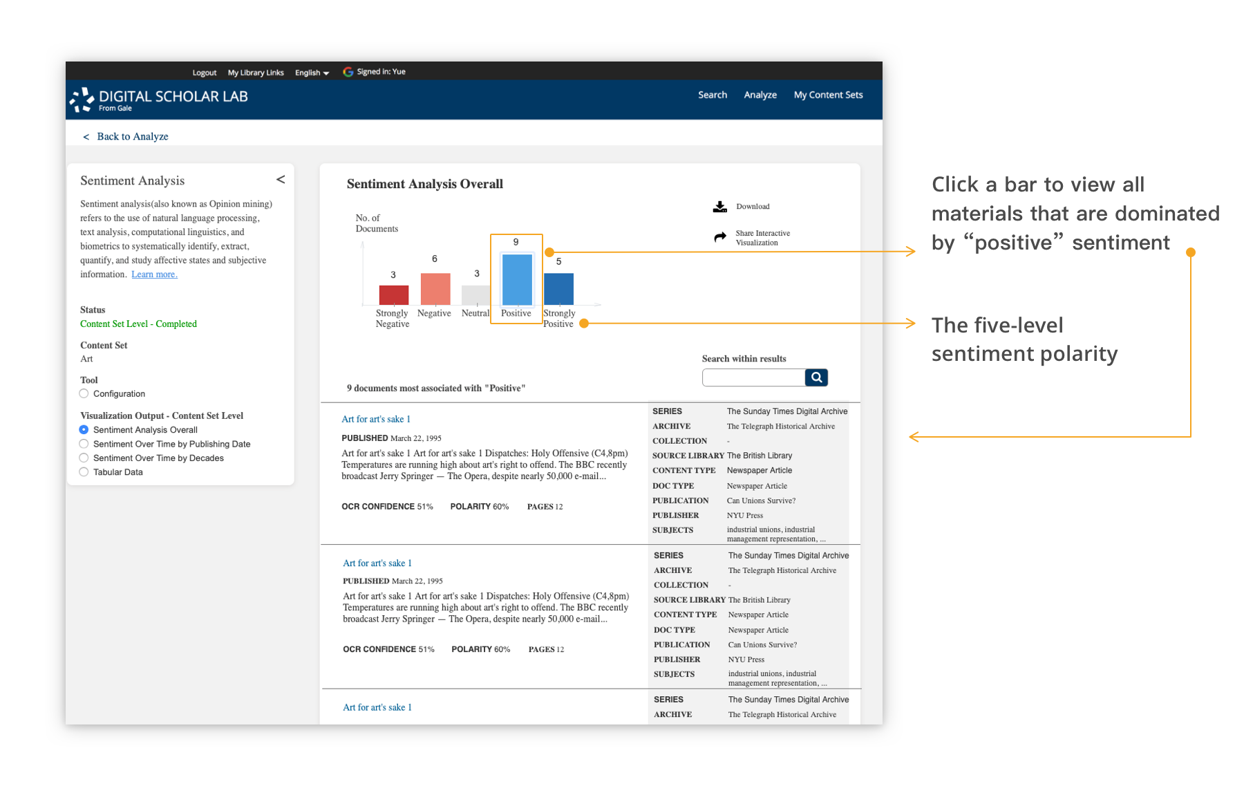
Bar chart is used to show the number of documents fall into the five polarity levels, strongly negative, negative, neutral, positive, strongly positive. Click on the bar to view all documents within the content set that have the corresponding sentiment.
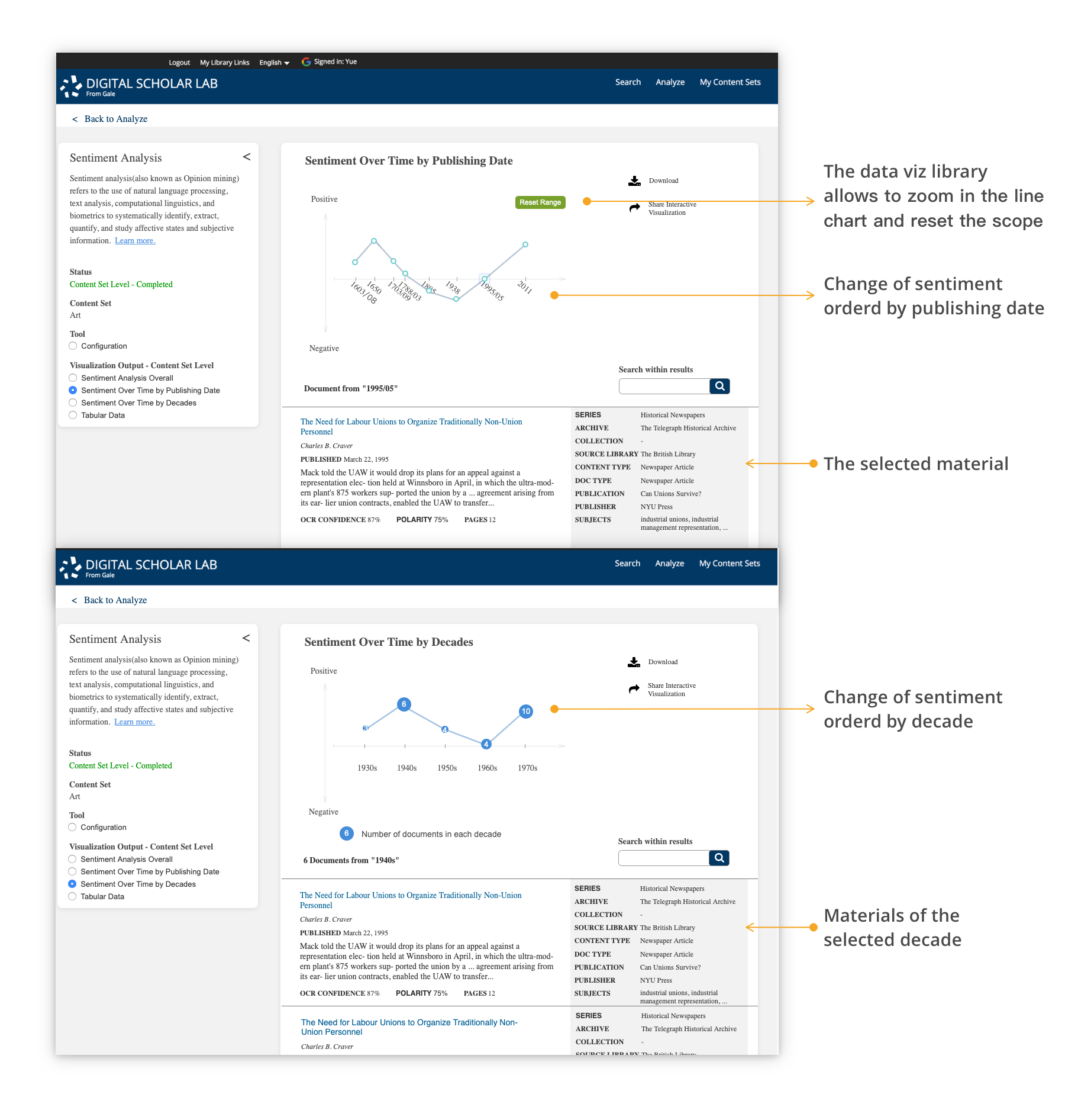
The line chart can most efficiently show the sentiment overtime. The top graph uses each document's polarity, and the bottom graph uses the average polarity of each decade to show the mainstream sentiment change of that topic/events.
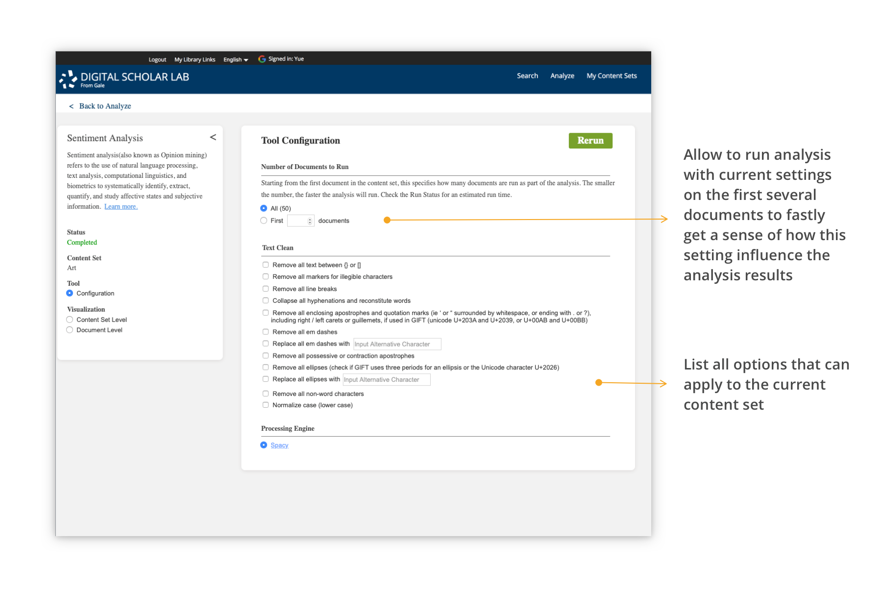
Since the sentiment analysis is ran on the OCRed text which might not be 100% accurate. Before sentiment analysis there should be several text cleaning on the content and format to improve the credibility of analysis result. But for most primary resources, automatic OCR and text clean can still be hard to provide high quality resources. The manual and crowd-sourcing text cleaning is another major challenge under developing.
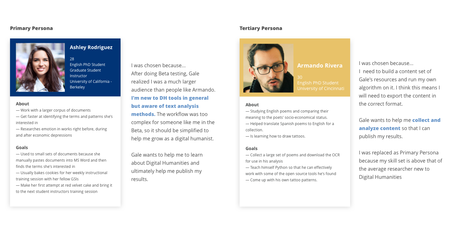
In the meanwhile, for pedagogical purpose, what's the purpose of each text cleaning rule should be explained to students like Ashley. And samples of how these rules work and affect the analysis should be provided.
Based on the tech stack the development team is using and development timeline, some visualization might not be able to delivery, so it's important to consider all these in the beginning. Some design might be able to realized easily based on the current tech stack, some design might need extra investment. For example, the sentiment overlay is not a common visualization and need extra effort for the development team to realize. But after evaluations with users, DH specialists, product team, development team and other related teams, it was a feature worth extra investment.
Since for people new to visualization they may not so sure about what's the most efficient way for them. So at early stage, visualization and DH experts can provide much more valuable feedbacks based on their experience. And when a relative complete design is created, the major users who are new to the tools should be involved into evaluation to test whether it's easier to learn and understand.
Since the design concept is mainly tested with specialists, the next step is to test whether text clean settings and visualization are understandable for pedagogical purpose, and how to better categories the visualization (group by analysis level or by context).